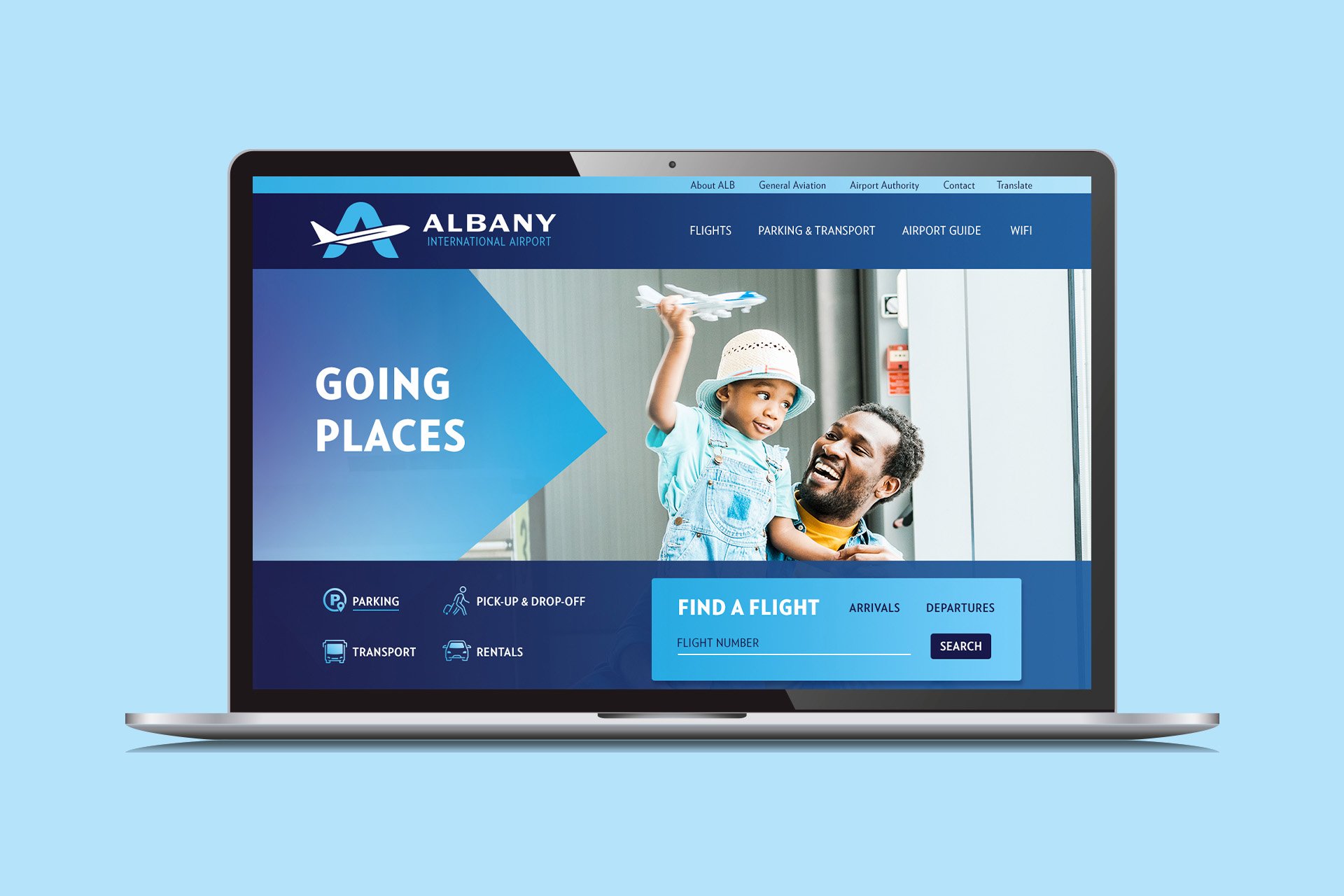
Albany International Airport Rebrand & Website
Work done under contract at Vibrant Brands. 2020 - 2022
The Albany International Airport wanted to change the way people think of regional airports. They recently developed a new master plan and made major technology improvements throughout the airport to make traveling safer and easier.
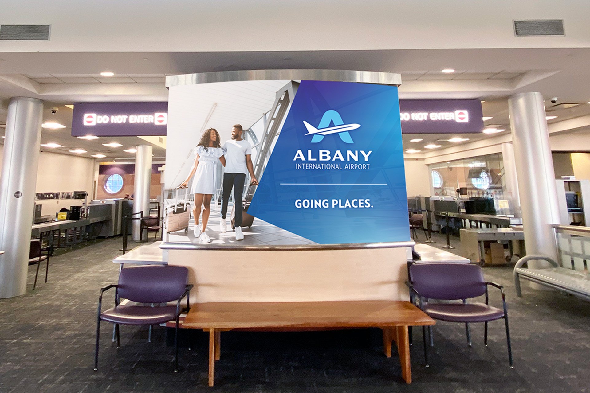
Their 90’s era branding had been outdated for decades and it was time to give their brand and their website a major facelift to match their new vision for the future of the airport.
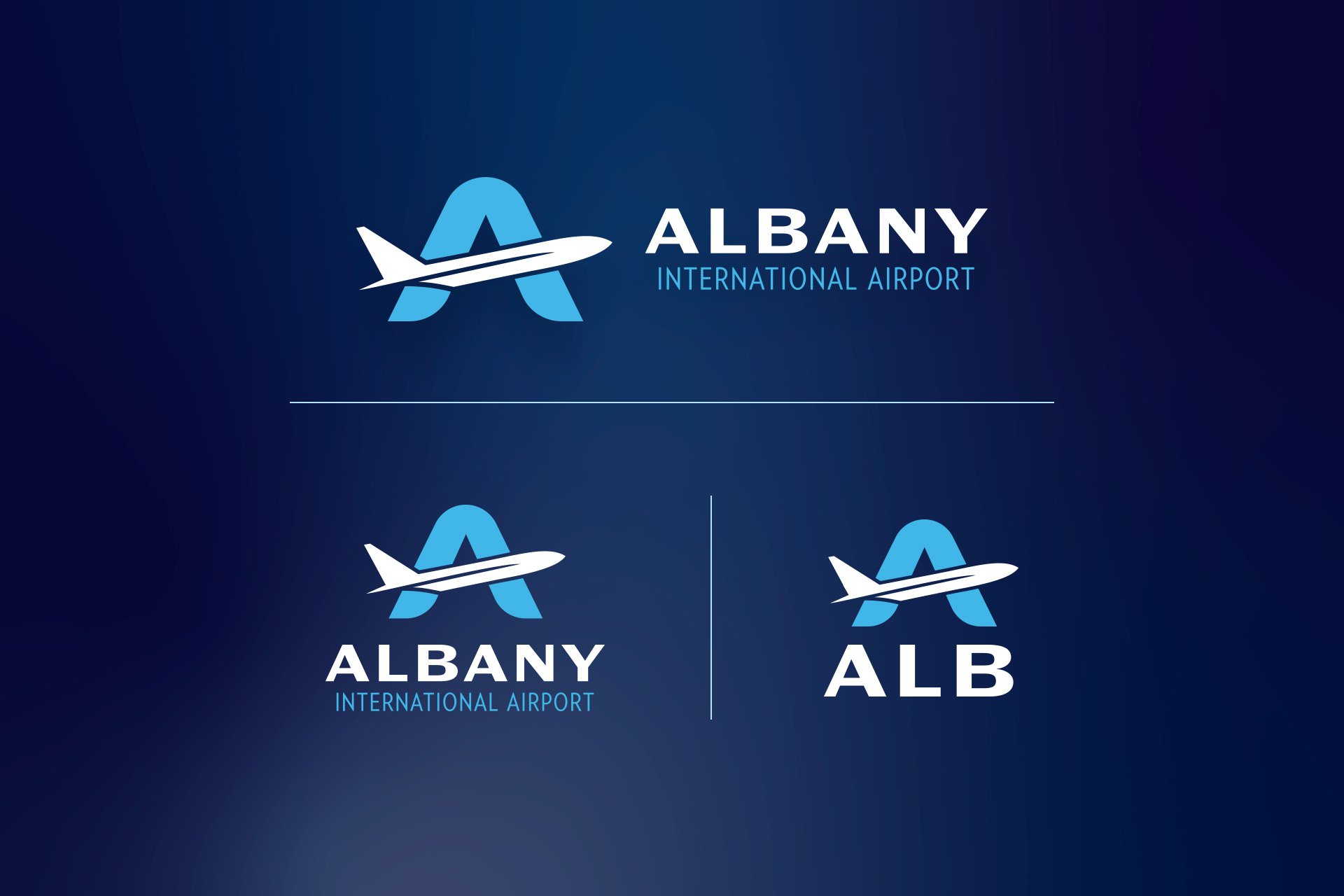
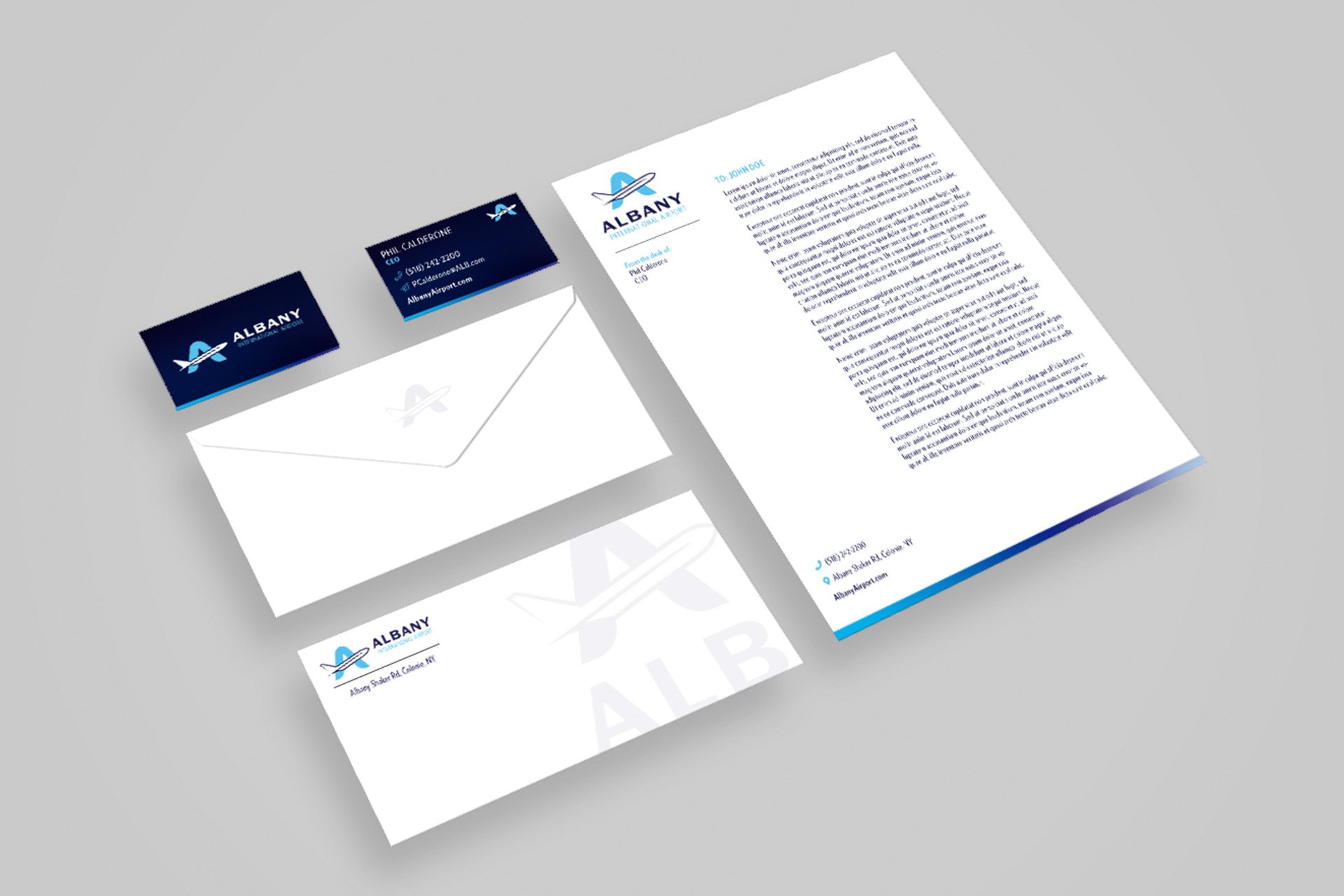
Albany International Airport is “The Gateway to the North East of New York State”. It provides easy access to tourists headed to the outdoor playground that is the Adirondacks and simultaneously offers convenient access to the capitol for business travelers. The A in the logo becomes that gateway using the image of a plane during takeoff to form the cross bar.
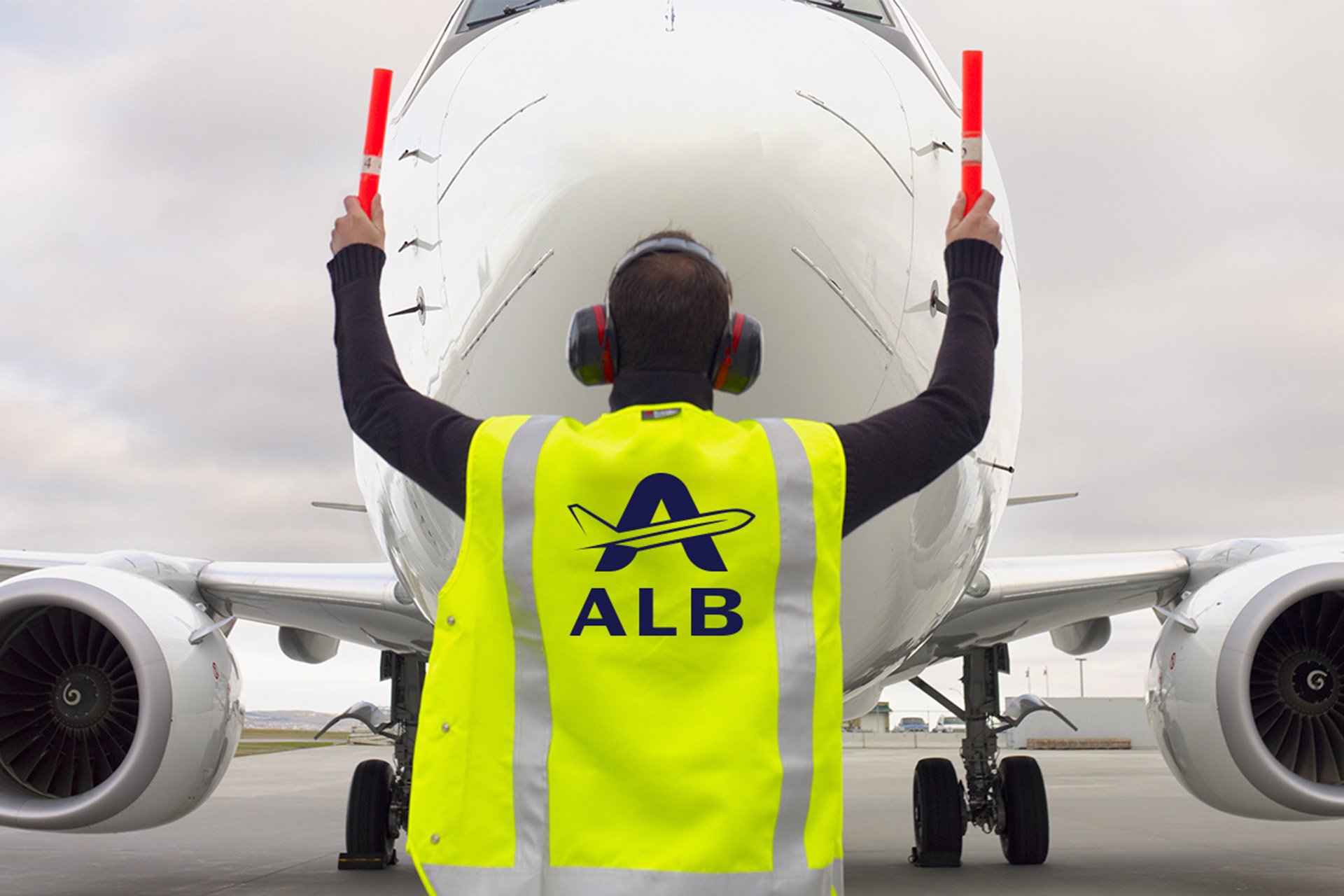
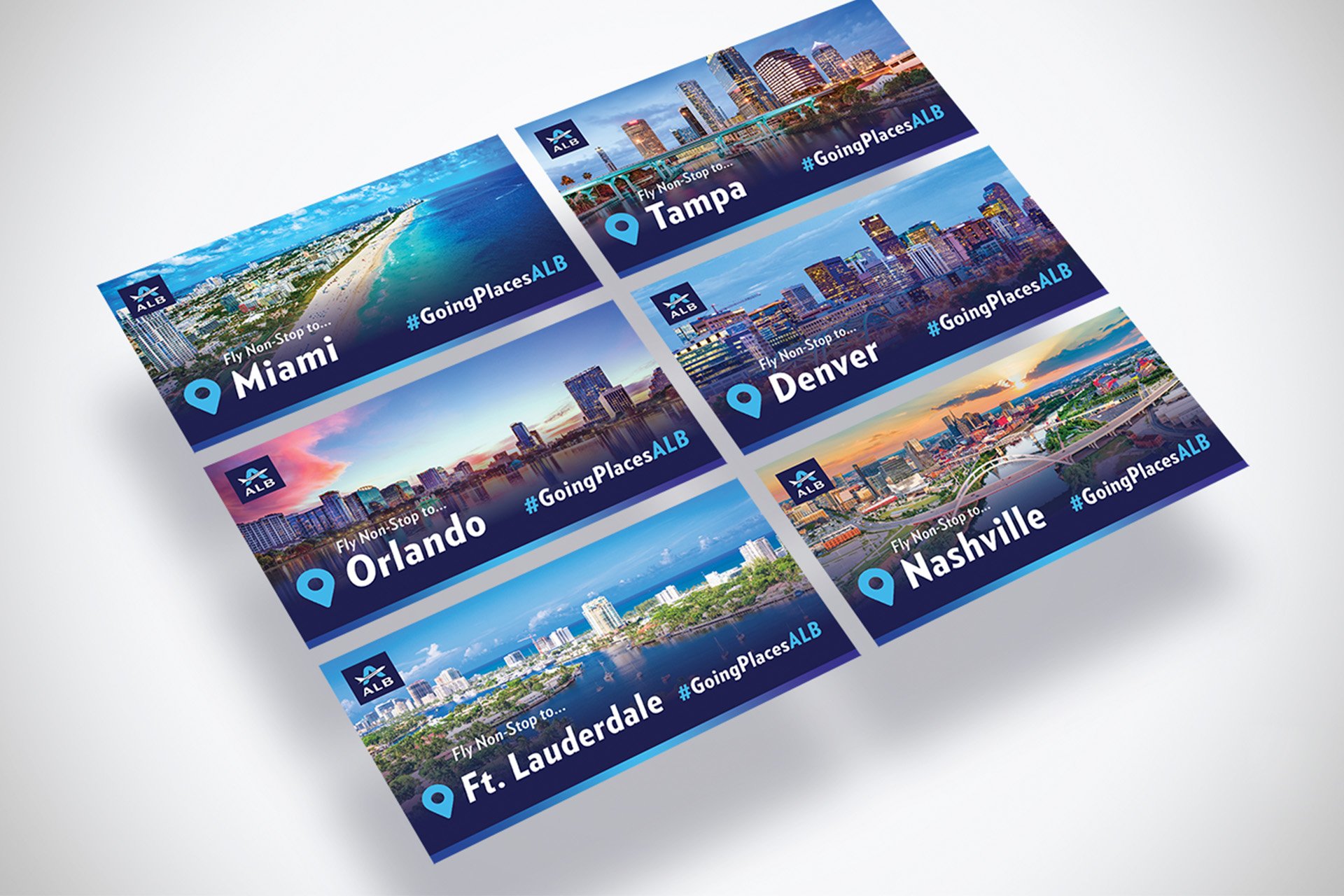
The airport has a large number of uses for the logo from pins to highway signs. This meant that the logo had to be responsive. We provided various lockups to ensure legibility in any scenario.
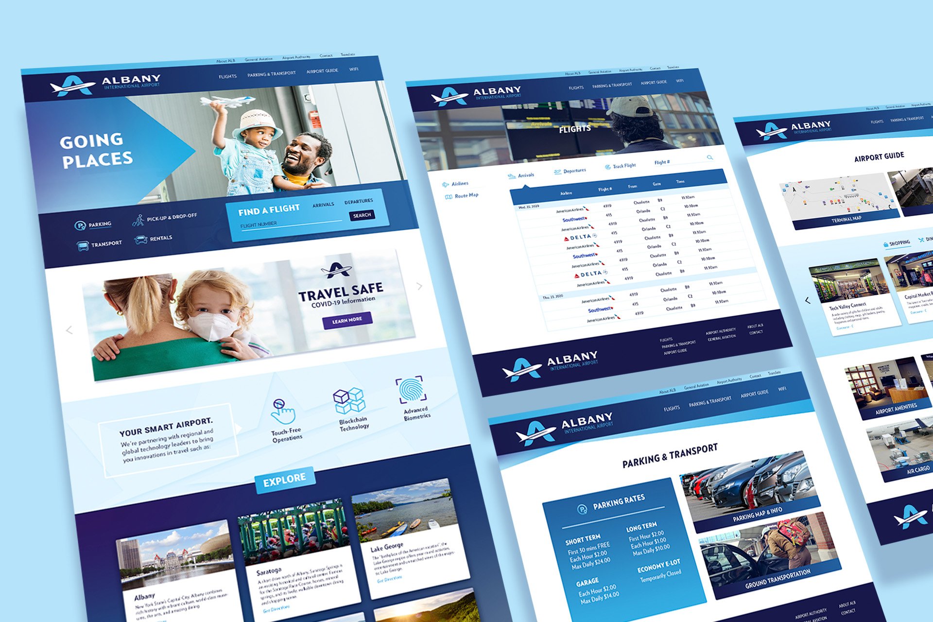
The airports website was seriously dated which was impacting users’ confidence in the site and the airport as a whole. Our goals were to optimize the site for use across a variety of devices and establish a strong hierarchy based on the most commonly used features.
We used analytics to identify the highest trafficked pages and features on their site and did user research to identify pain points. This helped us create an optimized user-flow with an appropriate hierarchy for each of the sites features.
